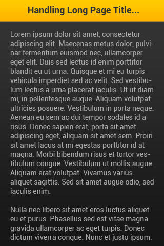
The Problem
Sometimes, we may have a page of our mobile website or mobile app with a long title fit in the header bar as shown in the picture below. This would be make our website or app looks ugly with such 3 lines of text. Problem: The title of the page is too long.
Instead, we can overcome this problem by applying some little-known CSS tricks.
The Solution
Here is the solution to solve the long page title. We could write the header h1 tag’s CSS as following:#header h1 {
width: 320px;
overflow: hidden;
white-space: nowrap;
text-overflow: ellipsis
}
The “text-overflow: ellipsis” declaration allows us to append 3 dots to the text that doesn’t fit into the header bar. Please take note that the “text-overflow: ellipsis” only works well when you have specified the “width“, “white-space: nowrap” and “overflow:hidden” to the header h1 tag.
The “white-space: nowrap” here is to instruct the browser NOT to break the long text into 2 lines. Without this, the h1 will just accomodate the long text in the defined width of header bar.
Here is the output with the solution:
 Solution: 3 dots appended to the end of chopped-off title.
Pretty simple right? Share this little-known trick to your colleagues, friends and other web workers!
Do you have any you CSS tricks? Please do share it with us on the comment section!
Update: Dynamic width div & ellipsis text
Last updates: 12 Dec 2014
Here is some little tricks to deal with responsive / different width of screen:
Wrap the h1 tag with a div with ID – “title_wrapper”, then write your css as below:
#header .title_wrapper {
   display: table;
    table-layout: fixed;
    width:100%;
}

#header .title_wrapper h1 {
    display: table-cell;
    overflow: hidden;
    white-space: nowrap;
    text-overflow: ellipsis;
    word-break: break-all;
    word-wrap: break-word;
}
That’s it! Now your page title works well across different screen sizes! It’s very useful, if you are developing responsive website. Share this useful tricks to your friends, teammates or co-workers!
