
Introduction to Off-Canvas Menu (a.k.a left-hand navigation)
Back to October 2011, Facebook introduced its new navigation pattern – “slide-out” navigation” which available on Facebook for iPad & iPhone application. The slide-out navigation consists of a panel that slide out from left of the main content area, revealing a list of clickable items that serves as a primary navigation for the application. This navigation pattern lets developers to add permanent navigation to their application without taking up valuable screen real estate. Users can choose to reveal the navigation anytime when they need it.
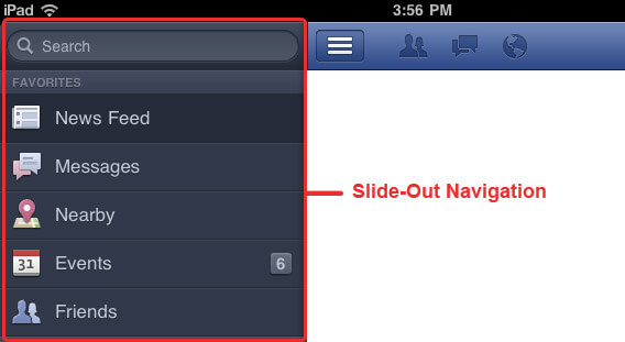
Facebook navigation pattern – Slide-Out Navigation
This tutorial will show you how to build a Facebook app-like slide-out navigation for your web app using CSS & JQuery.
HTML Markup
Here is the basic HTML structure of the slide-out navigation.
<!DOCTYPE html>
<head>
   <meta http-equiv="Content-Type" content="text/html; charset=UTF-8" />
   <title>Untitled Document</title>
</head>
<body class="pushmenu-push">
   <nav class="pushmenu pushmenu-left">
      <h3>Welcome Peter Yee</h3>
      <a href="#">Home</a>
      <a href="#">Profile</a>
      <a href="#">Games</a>
      <a href="#">Message</a>
      <a href="#">Settings</a>
      <a href="#">Logout</a>
   </nav>
   <div class="container">
      <div class="main">
         <section class="buttonset">
            <div id="nav_list">Show/Hide Left Push Menu</div>
         </section>
         <section class="content">
            <h1>Introducing Facebook Home</h1>
            <p>Facebook Home is software for your phone designed to put your friends above everything else. You can download Facebook Home for free or purchase it pre-installed on a phone. Facebook Home works together with the Facebook for Android and Facebook Messenger apps to enable its main features:</p>
            <ul>
               <li><strong>Cover feed:</strong> Glance at your phone for photos and posts from your Facebook News Feed.</li>
               <li><strong>Chat heads:</strong> Send and receive texts and Facebook messages in one place. Open, close and drag chat heads around your screen to keep chatting while you’re using other apps.</li>
               <li><strong>Notifications:</strong> See news as it happens with bigger, bolder notifications on your home screen.</li>
               <li><strong>App launcher:</strong> Get right to your favorite apps and post to Facebook from the same place.</li>
            </ul>
         </section>
         <!– END END content –>
      </div>
      <!– END main –>
   </div>
   <!– END container –>
</body>
</html>
The body of HTML document contains a class for us to animate it. We’ve divide the document into 2 main regions – navigation panel & info container.
The CSS
<style>
body {
     margin: 0;
}
 .pushmenu {
     background: #3c3933;
     font-family: Arial, Helvetica, sans-serif;
     position: fixed;
     width: 240px;
     height: 100%;
     top: 0;
     z-index: 1000;
}
 .pushmenu h3 {
     color: #cbbfad;
     font-size: 14px;
     font-weight: bold;
     padding: 15px 20px;
     margin: 0;
     background: #282522;
     height: 16px;
}
 .pushmenu a {
     display: block;
     color: #fff;
     font-size: 16px;
     font-weight: bold;
     text-decoration: none;
     border-top: 1px solid #57544e;
     border-bottom: 1px solid #312e2a;
     padding: 14px;
}
 .pushmenu a:hover {
     background:258ecd;
}
 .pushmenu a:active {
     background: #454f5c;
     color: #fff;
}
 .pushmenu-left {
     left: -240px;
}
 .pushmenu-left.pushmenu-open {
     left: 0px;
}
 .pushmenu-push {
     overflow-x: hidden;
     position: relative;
     left: 0;
}
 .pushmenu-push-toright {
     left: 240px;
}
/*Transition*/
 .pushmenu, .pushmenu-push {
     -webkit-transition: all 0.3s ease;
     -moz-transition: all 0.3s ease;
     transition: all 0.3s ease;
}
 #nav_list {
     background: url(icon_nav.png) no-repeat left top;
     cursor: pointer;
     height: 27px;
     width: 33px;
     text-indent: -99999em;
}
 #nav_list.active {
     background-position: -33px top;
}
 .buttonset {
     background: linear-gradient(center top , #6b85b3, #334d86);
     background:-moz-linear-gradient(center top , #6b85b3, #334d86);
     background: -webkit-gradient(linear, center top, center bottom, from(#6b85b3), to(#334d86));
     height: 16px;
     padding: 10px 20px 20px;
}
 section.content {
     font-family: Arial, Helvetica, sans-serif;
     padding: 10px 20px;
}
 </style>
The CSS styles that we implemented is quite simple and straightforward. Basically, we just need to concentrate on these 6 styles – .pushmenu, .pushmenu-left, .pushmenu-left.pushmenu-open, .pushmenu-push, #nav_list & #nav_list.active.
.pushmenu & .pushmenu-left
The navigation panel should always be accessible for the users, even if they scroll down the page. So the position of navigation panel should be fixed. That’s y we set the “position:fixed”. The “left:-240px” is set to hide the navigation panel from screen.
.pushmenu-left.pushmenu-open
Here we change the value of “left” property to 0, to reveal the navigation panel.
.pushmenu-push
We want the entire page included info container move to right when revealing the navigation panel. Here is how we apply the CSS transition property – “transition: all 0.3s ease”.
#nav_list & #nav_list.active
This is the style for the button (3 lines button on top left). The 3 lines button icon will be changed to back arrow icon when the navigation panel revealed.
JavaScript
Using JavaScript to toggle class of the navigation panel, document body & the 3 lines button (top left).
<script src="http://ajax.googleapis.com/ajax/libs/jquery/2.0.0/jquery.min.js"></script>
<script>
$(document).ready(function() {
	$menuLeft = $('.pushmenu-left');
	$nav_list = $('#nav_list');

	$nav_list.click(function() {
		$(this).toggleClass('active');
		$('.pushmenu-push').toggleClass('pushmenu-push-toright');
		$menuLeft.toggleClass('pushmenu-open');
	});
});
</script>
Save your document and preview on your browse. You will a list of clickable items when press on top left 3 lines button and hide it when press on the back arrow button.