
2012 has been a unusual year in PC market. Pc sales are lower than they were in the previous years. Accoding to the global market research company, Tablets and Smartphones sales are expected to exceed notebook in this year.
Nowadays, users no longer just use desktop to view websites. They now use a variety of different mobile devices such as iPhone, iPad, Tablets and much more. A responsive website can automatically adjust its page layout to suit the users devices. Thus giving them a best seamless experience.
This tutorial will shows you how to create a cross-browser responsive website with HTML5 & CSS3 media queries. To newbies, responsive web design might sounds complicated, but it is actually simpler than you think.
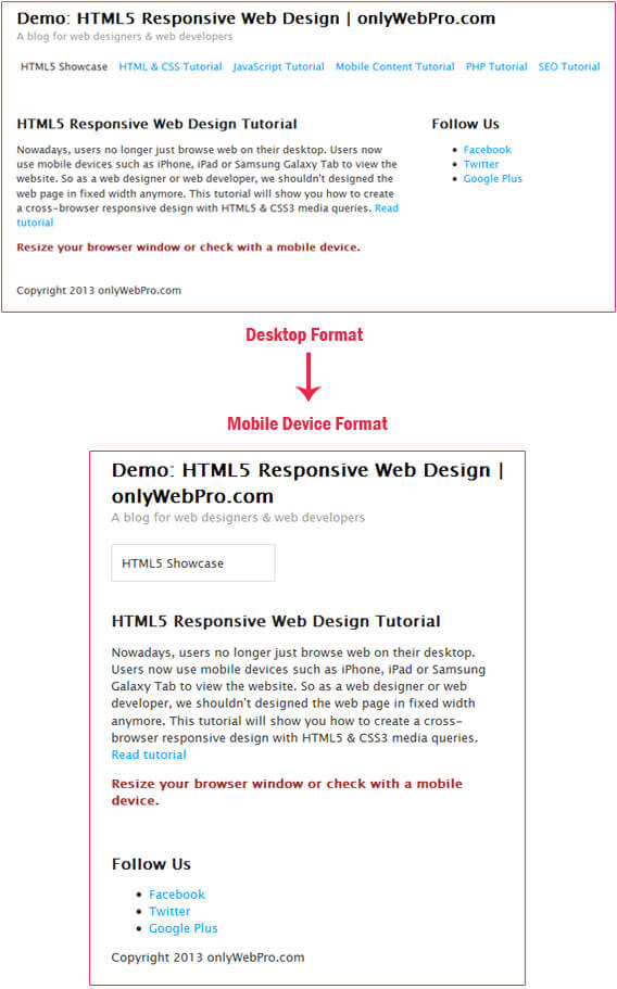
Here is the screenshot of what we are going to create in this tutorial:
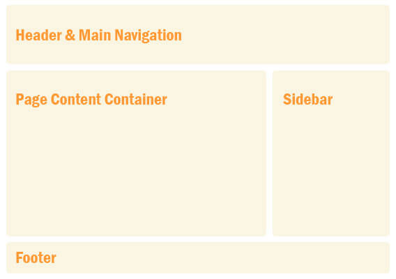
Step 1: The HTML Strucutre
Here is the HTML structure for the responsive website. In this example, we have a basic HTML5 page layout with a header, page content container, sidebar and a footer.
[html]
<!DOCTYPE html>
<html>
<head>
<meta http-equiv="Content-Type" content="text/html; charset=utf-8" />
<title>HTML5 Responsive Demo Web Design | onlyWebPro.com</title>
</head>
<body>
<div id="site_wrapper">
<header id="header">
<hgroup>
<h1>Demo: HTML5 Responsive Web Design | onlyWebPro.com</h1>
<h2>A blog for web designers & web developers</h2>
</hgroup>
<nav id="main_nav">
<ul>
<li class="current"><a href="http://www.onlywebpro.com/category/html5-showcase/">HTML5 Showcase</a></li>
<li><a href="http://www.onlywebpro.com/category/tutorials/html-css/">HTML & CSS Tutorial</a></li>
<li><a href="http://www.onlywebpro.com/category/tutorials/javascript/">JavaScript Tutorial</a></li>
<li><a href="http://www.onlywebpro.com/category/tutorials/mobile-content/">Mobile Content Tutorial</a></li>
<li><a href="http://www.onlywebpro.com/category/tutorials/php/">PHP Tutorial</a></li>
<li><a href="http://www.onlywebpro.com/category/tutorials/search-engine-optimization/">SEO Tutorial</a></li>
</ul>
</nav>
</header><!– END header –>
<section id="page_content">
<article>
<header>
<h3>HTML5 Responsive Web Design Tutorial</h3>
<p>Nowadays, users no longer just browse web on their desktop. Users now use mobile devices such as iPhone, iPad or Samsung Galaxy Tab to view the website. So as a web designer or web developer, we shouldn’t designed the web page in fixed width anymore. This tutorial will show you how to create a cross-browser responsive design with HTML5 & CSS3 media queries. <a href="http://www.onlywebpro.com/2013/03/18/design-your-own-responsive-web-template/">Read tutorial</a>
</p>
</header>
</article><!– END article –>
</section><!– END page_content –>
<aside id="sidebar">
<h3>Follow Us</h3>
<ul>
<li><a target="_blank" href="http://www.facebook.com/pages/Connect-with-onlyWebPro/149917668368025">Facebook</a></li>
<li><a target="_blank" href="http://www.twitter.com/onlyWebPro">Twitter</a></li>
<li><a target="_blank" href="https://plus.google.com/100910543735224109915">Google Plus</a></li>
</ul>
</aside><!– END sidebar –>
<footer>
<p>Copyright 2013 onlyWebPro.com</p>
</footer>
</div><!– END site_wrapper –>
</body>
</html>
[/html]
Step 2: Adding Meta Tag
We need a viewport meta tag to tells the browser to use the device width as viewport width and disable the initial scale.
[html]
<meta name="viewport" content="width=device-width, initial-scale=1.0">
[/html]
Step 3: Provide Fallback Support For IE
HTML5 tag such as <header>, <nav>, <section>, <article>, <aside>, <footer> are not supported in Internet Explorer 8 or older, so we have to provide fallback support for users using IE.
[javascript]
<!–[if lt IE 9]>
<script src="http://css3-mediaqueries-js.googlecode.com/files/css3-mediaqueries.js"></script>
<script src="http://html5shim.googlecode.com/svn/trunk/html5.js"></script>
<![endif]–>
[/javascript]
Step 4: The CSS
The CSS for the website is simple. Note that we have divided the CSS into 3 parts: – Borwser Settings, Base Structure & Navigation. I’m not going to get into the details of Browser Settings, instead we will focus on the Base Structure & Navigation sections.
[css]
<style type="text/css">
/*** Browser Settings ***/
body {
background: #fff;
color: #333;
font-size: 13px;
font-family: "Lucida Sans Unicode", "Lucida Grande", sans-serif;
line-height: 1.4;
}
h1 {
color: #000;
font-size: 20px;
font-weight: bold;
margin: 0;
}
h2 {
color: #999;
font-size: 13px;
font-weight: normal;
margin: 0 0 10px;
}
h3 {
color: #222;
font-size: 16px;
font-weight: bold;
margin: 0;
}
a {
color: #09F;
text-decoration: none;
}
a:hover {
color: #333;
}
/*** Base Structure ***/
#site_wrapper {
margin: 0 auto;
width: 90%;
}
#page_content {
float: left;
width: 65%;
padding: 0 5% 3% 0;
}
#sidebar {
float: right;
width: 30%;
}
footer {
clear: both;
width: 100%;
}
/*** Navigation ***/
#main_nav {
position: relative;
margin: 20px 0 40px;
}
#main_nav ul {
margin: 0;
padding: 0;
}
#main_nav ul li {
display: inline-block;
list-style-type: none;
margin: 0 5px 10px;
padding: 0;
}
#main_nav ul li a:hover {
color: #333;
}
#main_nav ul li.current a {
color: #333;
border-radius: 5px;
}
</style>
[/css]
Responsive design is percentage based layout, instead of using fixed pixel value, we used percentage value for the width of all base structures.
We aligned the main navigation button to left by specifying ‘display:inline-block‘.
Step5: The Responsive
Now here is the magic that turns our website into responsive. The CSS media queries is the key component for responsive web design, it tells the browser how to render the page for specified viewport width. If you are not familar with media queries, please be sure to read previous article on media queries.
[css]
<style type="text/css">
@media screen and (max-width: 650px) {
#header {
height: auto;
}
#page_content {
width: auto;
float: none;
margin: 20px 0;
}
#sidebar {
width: 100%;
float: none;
margin: 0;
}
/*** Navigation ***/
#main_nav {
position:relative;
min-height: 30px;
}
#main_nav ul {
background: #fff;
border: 1px solid #ddd;
padding: 5px 0;
position: absolute;
width: 40%;
}
#main_nav ul li {
display: none;
margin: 0;
}
#main_nav ul li.current {
display: block;
}
#main_nav ul li a, #main_nav ul li.current a {
background: 0;
display: block;
padding: 5px 10px;
}
#main_nav ul li.current a {
color: #333;
}
#main_nav ul:hover li {
display: block;
}
}
[/css]
On 650px breakpoint, we removed ‘float‘ property for page content container and sidebar. We try to hide all main navigation by specifying ‘display:none‘, but except for the ‘.current‘ button. Then when users touch / mouse over on the main naigation, we set the main navigation buttons back to ‘display:block‘, this will turn the main navigation into a dropdown box.
Save all your files and view it on browser. Then resize your browser window, you should see your website automatically adjust its layout to suit your window.
Conclusion
You just learned how to design your own responsve web template. We hope you enjoyed this tutorial and look forward to your feedback!