The Full Series
Hi guys! Welcome to the part 3 of jQuery Mobile for Absolute Beginners. In this lesson, we will discuss on the form elements that used in jQuery Mobile. If you haven’t already, be sure to read the previous articles of this series first!
Form in jQuery Mobile
The jQuery Mobile automatically converts the HTML form elements into finger-friendly, more attractive and useable on a mobile device. jQuery Mobile requires all form elements must be wrapped in a valid <form> tag that has an action and method, all form elements be paired with a meaningful label, and all form elements should have unique id across the pages in a site, and please keep in mind that, the form data submission for jQuery Mobile is automatically handled via AJAX.
Text Input & Textareas Element
Constructing a text input or textarea in jQuery Mobile is same as you coded with standard HTML elements.
[html]
<form action="" method="get">
<label for="basic">Username:</label>
<input type="text" name="username" id="username" value="" />
<label for="remarks">Textarea:</label>
<textarea name="remarks" id="remarks"></textarea>
</form>
[/html]
Outcome

This will produce a basic text input & textarea with default styles, which set the width of the elements to 100%.
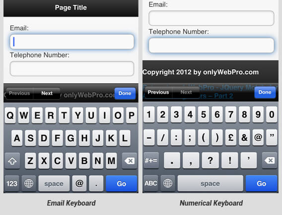
With jQuery Mobile, you can apply HTML5 input types such as password, email, number, tel into your input text elements. By specifying input types, mobile device users can speed up their data entry with specialized keyboard provided automatically by their browser. Example:

If you want to visually group your text input elements, you can wrap the text input in a container with the data-role=”fieldcontain” attribute as shown below:
[html]
<div data-role="fieldcontain">
<label for="name">Username:</label>
<input type="text" name="username" id="username" value="" />
</div>
[/html]
Outcome

Using data-role=”fieldcontain” attribute, aligns the input and associated label side-by-side, breaks and divide elements into 2 rows below 480px.
Search Input Field
By settings an text input as search input field, jQuery Mobile styles a text input with a magnified search icon and provides an “x” icon to clear the field once you start typing.
[html]
<label for="search">Search:</label>
<input type="search" name="search" id="search" value="" />
[/html]
Outcome

Select Menus
jQuery Mobile leverages native OS option menu by default, which means when select menu is tapped, the native OS menu will open.
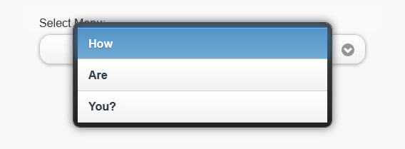
The framework also provide option for us to use custom-styled select menus instead of the native OS menu. To use custom-styled select menu, you just have to add data-native-menu=”false” attribute to your select menu.
[html]
<label for="select-menu" class="select">Select Menu:</label>
<select name="select-menu" id="select-menu" data-native-menu="false">
<option value="how">How</option>
<option value="are">Are</option>
<option value="you">You?</option>
</select>
[/html]
Then your select menu will become like this:
Outcome

Flip Toggle Switch
The flip toggle switch is used for true or false data input. To construct a flip toggle switch, start with a select menu with ONLY 2 options and add data-role=”slider” to the select menu. Remember that? Flip toggle switch is used for true or false data input! So, the first option will be styled as “on” status and the second will be “off” status.
[html]
<label for="flip-switch">Flip switch:</label>
<select name="flip-switch" id="flip-switch" data-role="slider">
<option value="on">True</option>
<option value="off">False</option>
</select>
[/html]
Outcome

Slider
To use a slider in your jQuery Mobile page, add an input with the type=”range” attribute. The jQuery Mobile will automatically style and enhance the slider without any need to apply a data-role attribute.
[html]
<label for="slider">Input slider:</label>
<input type="range" name="slider" id="slider" value="20" min="0" max="100" />
[/html]
Outcome

There are some other attributes that you can use with slider such as:
- step: To force the slider to snap to a specific increment.
- data-highlight: Have a highlight on the slider.
Extras: If you like to find out more about constructing jQuery slider for desktop, please read our previous tutorial – Build A jQuery Range Slider Within 5 Minutes!
Checkboxes & Radio Button
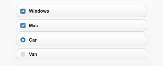
To construct checkbox and radio button, you can write your code as same as standard HTML elements.
[html]
<label for="checkbox">Windows</label>
<input type="checkbox" name="checkbox" id="checkbox" />
<label for="checkbox2">Mac</label>
<input type="checkbox" name="checkbox2" id="checkbox2" />
<input type="radio" name="radio-choice" id="radio-choice-1" value="choice-1" checked="checked" />
<label for="radio-choice-1">Car</label>
<input type="radio" name="radio-choice" id="radio-choice-2" value="choice-2" />
<label for="radio-choice-2">Van</label>
[/html]
Outcome

For the radio button, the framework allow us to turn it into grouped button sets / tabs navigation where only a single button can be selected at once. To construct a tabs, what you need to do is just to wrap radio tag in a <fieldset> tag, add the data-role=”controlgroup” and the data-type=”horizontal” to the fieldset.
[html]
<fieldset data-role="controlgroup" data-type="horizontal" >
<input type="radio" name="radio-choice" id="radio-choice-1" value="choice-1" checked="checked" />
<label for="radio-choice-1">Car</label>
<input type="radio" name="radio-choice" id="radio-choice-2" value="choice-2" />
<label for="radio-choice-2">Van</label>
</fieldset>
[/html]
Outcome

Conclusion
You have just learned about the usage and the attributes of form elements in jQuery Mobile. You know how the framework styles the element, and you also know when to use the element and how to use them with jQuery Mobile.
Stay tuned for more. 🙂
